In a previous article on this blog, I talked about optimizing the speed of a WordPress blog. One of the problems encountered came from WordPress itself, which multiplies the javascript files loaded ad nauseam, even to the point of needlessly duplicating them. After leaving WordPress for Ghost, I was finally able to resume my attempts at optimization to reach the famous "100/100" of Google Pagespeed Insights... on some pages only. Let me share this wonderful adventure with you!
The limitations
The 100/100 only holds on index pages. As soon as you enter an article, the score drops to somewhere between 98 and... much less. Two reasons for that:
- I have not yet enabled server-side caching for the forum hosting the articles' comments. As a result, the file containing the comments data is not cached.
- Google's main workhorse for improving web performance, images are sometimes not optimized as much as they should be.
The first point will fix itself. You just have to configure the NginX server. For the second point, it is harder. Besides the difficulty of using the lossless compression algorithms suggested by Google, the biggest problem of images on the web is adapting to people's connections and the size of their displays. The most common solution, rather well handled by WordPress, consists of generating several versions of varying size for the uploaded images. Ghost is at version 0.7.x, so do not be surprised if some important features are missing. Among these, image handling is quite catastrophic, since it is only possible to upload a single version of an image. The "featured images" are a concrete example of the problem, especially with a theme like mine: between the thumbnail versions of the home page and the full-screen versions of the articles, it is impossible to find one size that fits everything.
Consequently, either you go for large images resized on the fly and suffer heavy performance losses, or you use versions that are an eyesore when displayed large. I can only wait for a Ghost update to fix this mistake: either the one that will natively add image handling, or the one that will make it possible to create your own plugins (in which case, I will develop one to handle images). Another possibility, less likely and still requiring Ghost's cooperation, would be to wait for the official implementation of the HTML5 "picture" tag. It allows you to specify different image sources depending on the screen size.
The CSS challenge
Optimizing this blog was no small feat. Let us frame the problem. You have (1) optimized your images, (2) minified your javascript and css files, (3) enabled GZIP compression and server-side caching, (4) rapped your host's knuckles so they improve connection speed. You finally breathe. All these efforts earned you a score above 90 on Google Pagespeed Insights, and that makes you proud. But not completely: those last obscure percentage points still remain, hidden behind the following enigmatic piece of advice. "Optimize CSS delivery of the following URLs". What on earth is that?
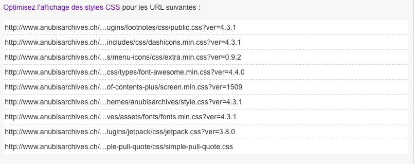
You hate that message too, don't you?
What Google is trying to tell you is that in a perfect world, the "secondary" CSS properties should ideally be loaded in a deferred manner. Among other things, Google talks about "the fold" ((The fold is a term originally used for the line marking the boundary between the submerged and the emerged part of a ship.)), the delimitation between the immediately visible part of your site and the part below. To optimize your site, you would therefore have to (1) determine which CSS properties are necessary for the initial display, (2) load them as a priority and (3) delay the loading of the "secondary" properties via javascript code.
Step by step
(1) Identifying the properties needed for your page's initial display is the hardest part. First, because many sites are not designed with the fold in mind. The content of a text or a list of articles is displayed right at the top of the page, so the entire CSS must be loaded. It is no accident if this blog's new theme offers you, on each page, a full-screen image with a few first pieces of information to cut your teeth on: this strategy allows an easy delimitation between what must be loaded first (the properties related to the menu and the full-screen images) and what comes after (the content of the page proper). Then, it is not easy to determine which properties are necessary for the initial display: you generally swim in an ocean of CSS classes. Fortunately, some people have developed JS scripts you can use on your pages. Basically, the idea is to go over all the properties used in the visible space of your window. The result is not perfect, but it will give you a first idea of the work required. Follow this link (in English) if you are interested.
(2) From there, you can load the priority CSS properties. Google generally recommends using inline-css, that is to say wedging said properties into a <style> tag inside your page's <head>. The idea is to avoid calling two CSS files and generating useless traffic on the Internet. One of the problems with this advice relates to the "maintainability" of your CSS code: it is indeed difficult to modify minified CSS code, wedged inside your HTML code. If you use (and configure) professional, performant tools, you will be able to automate the deployment of your priority CSS code into the HTML pages' header. Failing that, you can go for my solution: maintain a parallel stylesheet, minify it and copy/paste the result into your page's header at every update.
(3) Delaying the loading of the secondary CSS is more trivial. You can use the following code, provided by the team behind Pagespeed Insights (remember to replace /url/feuille/de/style with your stylesheet's URL, obviously):
var cb = function () {
    var l = document.createElement('link');
    l.rel = 'stylesheet';
    l.href = '/url/feuille/de/style';
    var h = document.getElementsByTagName('head')[0];
    h.parentNode.insertBefore(l, h);
};
var raf = requestAnimationFrame || mozRequestAnimationFrame ||
        webkitRequestAnimationFrame || msRequestAnimationFrame;
if (raf) raf(cb);
else window.addEventListener('load', cb);
Basically, this bit of javascript checks that your initial resources are loaded before adding the stylesheet specified by the variable l. The logical consequence of using such code is that the rare enlightened souls who disable javascript in their browsers will not be able to load your stylesheet. To work around this problem, you can always use a <noscript> tag in your page's header and load said stylesheet there.
A certain price to pay
While these changes do bring an appreciable speed gain, they carry limitations that can get in the way. I see three of them:
- First, you must build your site with the fold in mind. Sometimes, this artificial separation is not desirable. Some pages of this blog should not offer a full-screen image (I am thinking in particular of pagination). It is a painful sacrifice.
- The asynchronous loading of some resources deemed "secondary" is not relevant if your users use the browser's "back" button. You can experiment with this blog: open another page, then come back to this one. Your scrolling cursor will take you back, by default, to the bottom of the page, and the elements located there will take a few seconds to load. It is not a critical flaw, but these details hurt the user experience. Is winning a few microseconds of loading really worth it?
- Finally, from a more technical standpoint, no caching can be done for the properties you specify in inline-css. In this blog's case, that represents nearly 10k (uncompressed) loaded additionally on every page, whereas it would have been conceivable to cache them once the first load was done. It would seem, however, that the solution touted by Google remains more performant in the overwhelming majority of cases.
Be that as it may, this blog has far bigger concerns than nitpicking with Google's recommendations. To gain even more performance, a genuine optimization of the CSS and JS code is necessary. As for you, readers, I hope you found here a few answers that will be useful in your web optimizations.